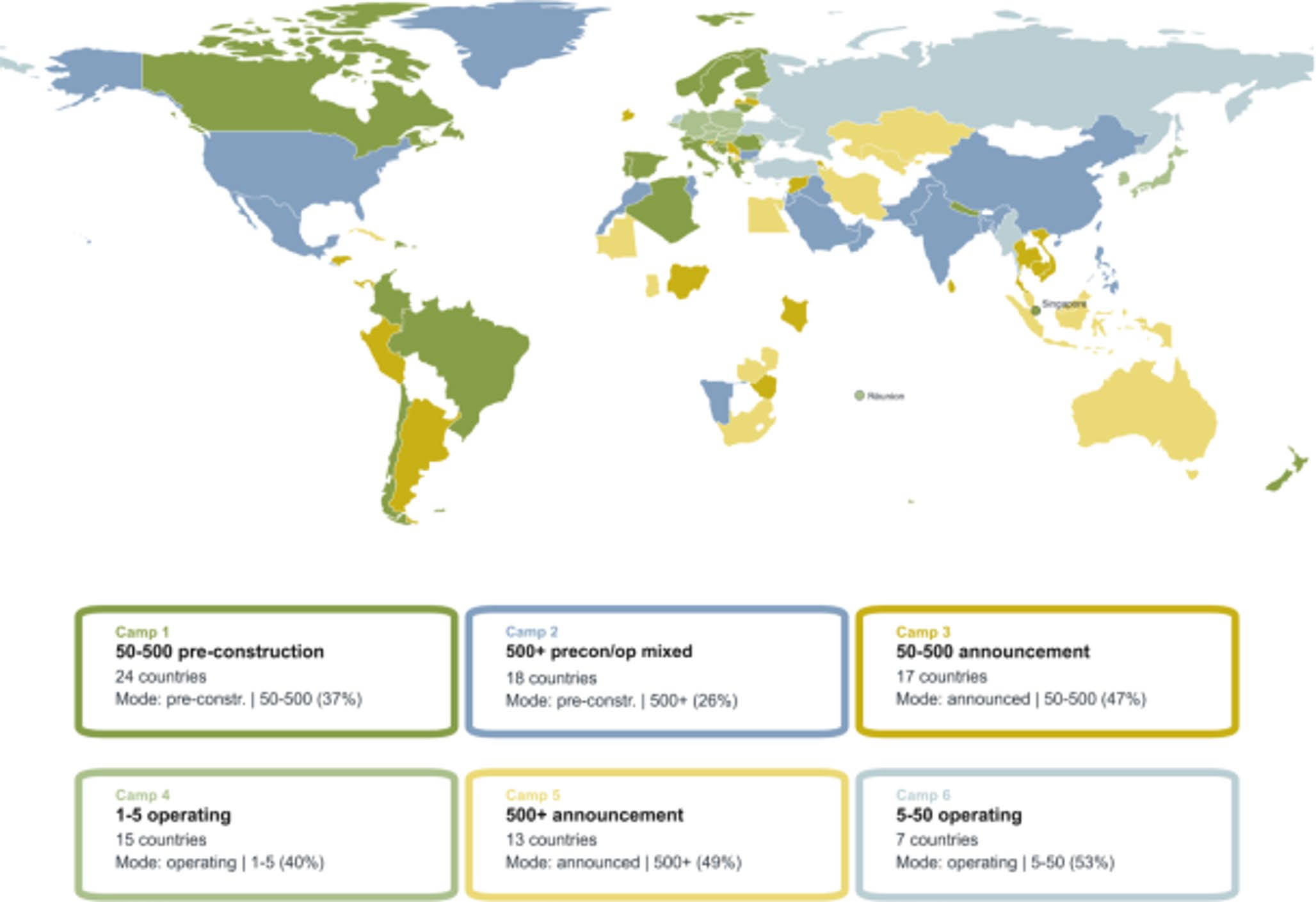
The Question Behind the Map
Aggregate megawatts show how large a country’s solar portfolio is, but not how that portfolio is organized. This project turns phase-level infrastructure records into comparable national profiles, allowing countries with very different scales to be analyzed by project size, development status, and internal composition.
The analysis supports the open-access paper Beyond megawatts: Structural configurations and project ecologies in global utility-scale solar.
Turning Projects into Comparable Profiles
The retained dataset contains:
- 98,942 phase-level solar project records,
- 94 countries,
- 3.57 TW of retained capacity, and
- operating, construction, pre-construction, and announced project phases.
I represented each country across 16 predefined size-status modes:
| Dimension | Categories |
|---|---|
| Project size | 1-5 MW, 5-50 MW, 50-500 MW, 500+ MW |
| Project status | operating, construction, pre-construction, announced |
This 4 x 4 design converts a country from a single total into a structured feature profile. Separate matrices preserve two analytical views: project counts and capacity weights.
Why Normalization Changes the Picture
The pipeline:
- filters and standardizes phase-level records,
- assigns each project to a size-status mode,
- builds country-by-mode count and capacity matrices,
- row-normalizes each country profile,
- computes cosine similarity and sparse top-k country projections,
- applies Louvain community detection, and
- audits community strength, sensitivity, and mode-level interpretation.
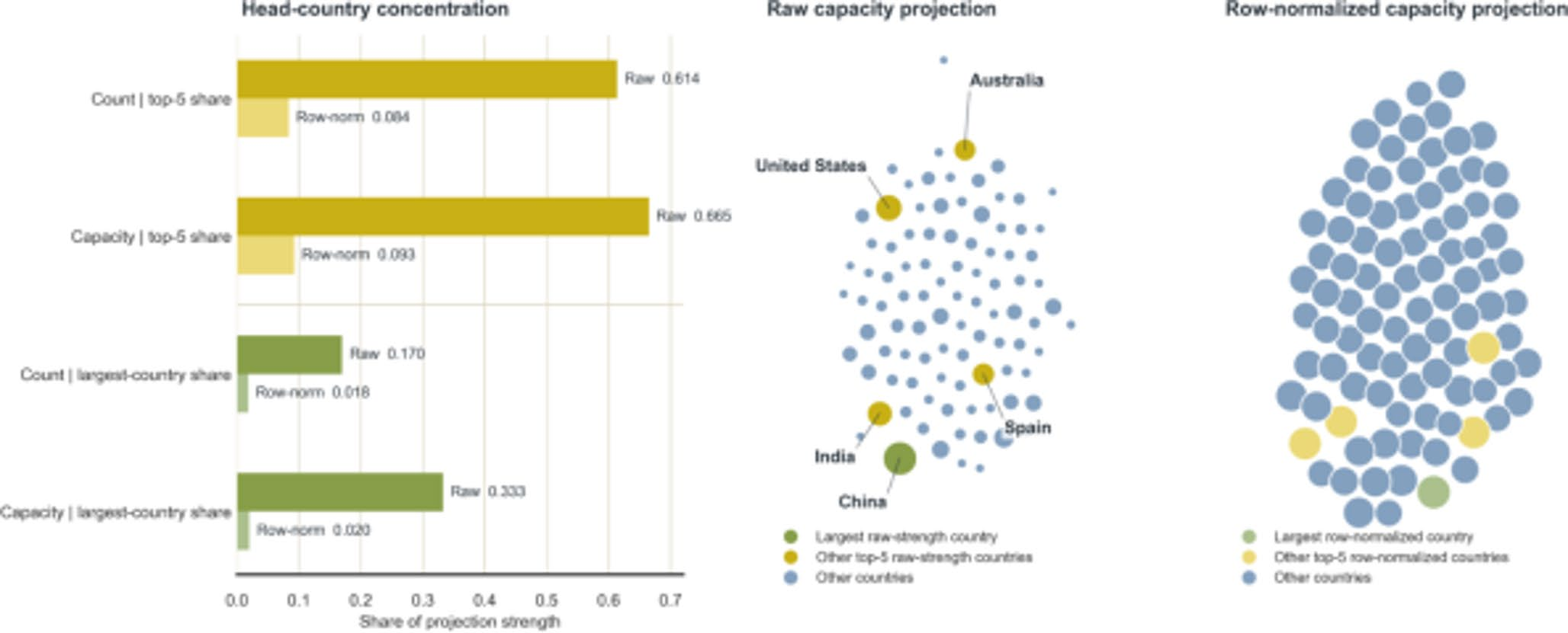
Normalization is the key analytical decision. In the raw capacity projection, the five largest countries account for 0.665 of total projection strength; after normalization, their share falls to 0.093. The count view falls from 0.614 to 0.084. This changes the task from ranking national scale to comparing internal portfolio structure.
Two Views of the Same Solar System
The model identifies:
- 6 capacity-based national camps, describing system weight,
- 5 count-based project ecologies, describing project frequency, and
- only partial alignment between the two views.
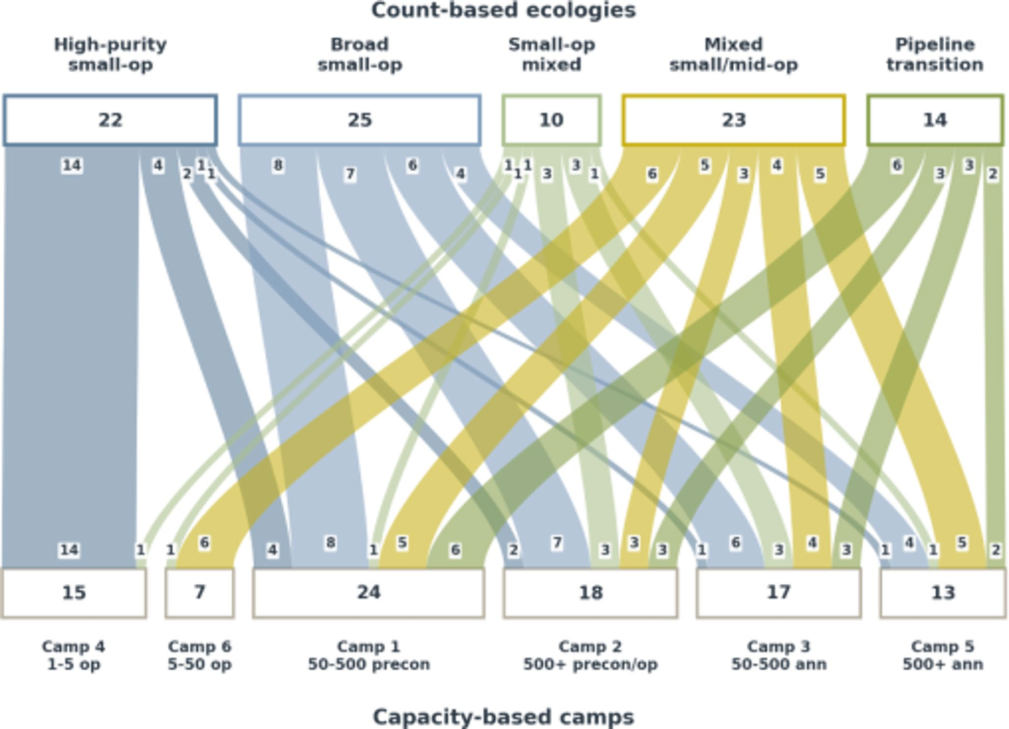
The correspondence analysis shows why both matrices are necessary. A country may contain many small operating projects by count while a few very large announced or pre-construction projects dominate its capacity profile.
How Strong Is the Pattern?
The observed communities were compared with degree-preserving null networks:
| View | Observed modularity | Null mean | z-score |
|---|---|---|---|
| Capacity | 0.684 | 0.314 | 37.1 |
| Count | 0.618 | 0.293 | 33.3 |
Across 40 null replicates, no randomized graph reached the observed modularity. Sensitivity checks also tested alternative size bins and country-inclusion rules.
A mode-salience audit then identified the features driving differentiation. The strongest shared signals came from operating projects below 50 MW and announced or pre-construction projects between 50 and 500 MW; the 500+ MW announced mode was especially important in the capacity view.
What to Keep in Mind
The value of this project lies less in producing another country ranking than in showing how analytical design changes what becomes visible. Defining a comparable unit, separating count from capacity, normalizing before projection, and testing the resulting communities all help distinguish structural patterns from simple differences in scale.
The workflow is reproducible from retained records through matrices, diagnostics, figures, and sensitivity checks. It is also deliberately bounded: capacity structure does not directly measure electricity generation, project completion, land use, grid integration, or policy effectiveness.